Office Wall Decor: 31 Ideas That Work on Camera and in the Room
Most office wall decor advice is written as if an office wall were a living room wall that happens to be somewhere else. It is not. An office wall has two audiences a home wall never has: the people who walk past it every day without choosing to, and — if you work from home — the colleagues, clients and interviewers who stare at it through a webcam several times a week.
That second audience changed everything and almost nobody has updated their advice for it. Meanwhile, in commercial spaces, art has stopped being decoration and become a measured amenity: a study of 7,600 office workers across sixteen countries found that people in workspaces with natural elements reported 15% higher wellbeing, 6% higher productivity and 15% higher creativity. That is why office artwork now appears in design budgets as a line item rather than an afterthought.
So these 31 ideas are organised by zone — arrival, waiting, cafeteria, open plan, meeting rooms, quiet spaces, circulation and the home office — because what works behind a reception desk fails completely above a bank of workstations.
The best wall decor for an office is calm, large and low-contrast: abstract or nature-derived art, textured wall systems, or large-scale photography. Avoid readable text, busy patterns and high contrast — they distract in person and turn to mush on a webcam. In shared spaces, scale creates a landmark; in a home office, one piece hung slightly above standard height behind your shoulder is all you need.
The Backdrop Test
Before you hang anything in a workspace, run it past four questions. They take ten seconds and they rule out most of what gets bought for offices.
- Can someone read it? If there are legible words, people will read them instead of listening to you — and they will read them a hundred times. Motivational typography is the single most common office wall mistake.
- Does it survive a webcam? Fine detail, high contrast and busy pattern all resolve badly at video-call resolution. What looks sophisticated in the room looks like static on a call.
- Is it hung for the camera or the room? A webcam sits at eye level and crops the bottom of the frame. Art at standard gallery height disappears below the shot. In a home office, hang four to six inches higher than you otherwise would.
- Does it calm or agitate? This is the one with research behind it. Nature-derived pattern, organic form and muted palettes measurably reduce cognitive strain. Sharp geometry and saturated colour do the opposite over an eight-hour day.
The rule for shared spaces: one piece at genuine scale beats six at polite scale. In lobbies and circulation routes, scale is what creates a landmark — something people navigate by and remember.
Reception and arrival zone wall decor
Reception areas are being rebuilt as concierge-style arrival zones — the hotel-arrival experience applied to the workplace. This is the wall that sets the tone before anyone says a word, and it is where professional office wall art earns its budget.
1. A commissioned mural at full scale
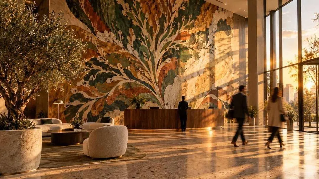
Abstracted organic forms across a double-height wall, hand-painted rather than printed. Commissioning takes longer and costs more than buying, but it produces something that belongs to this building and cannot be found in a catalogue. For a company whose brand is its differentiator, that is the point.
2. A dimensional timber fin wall
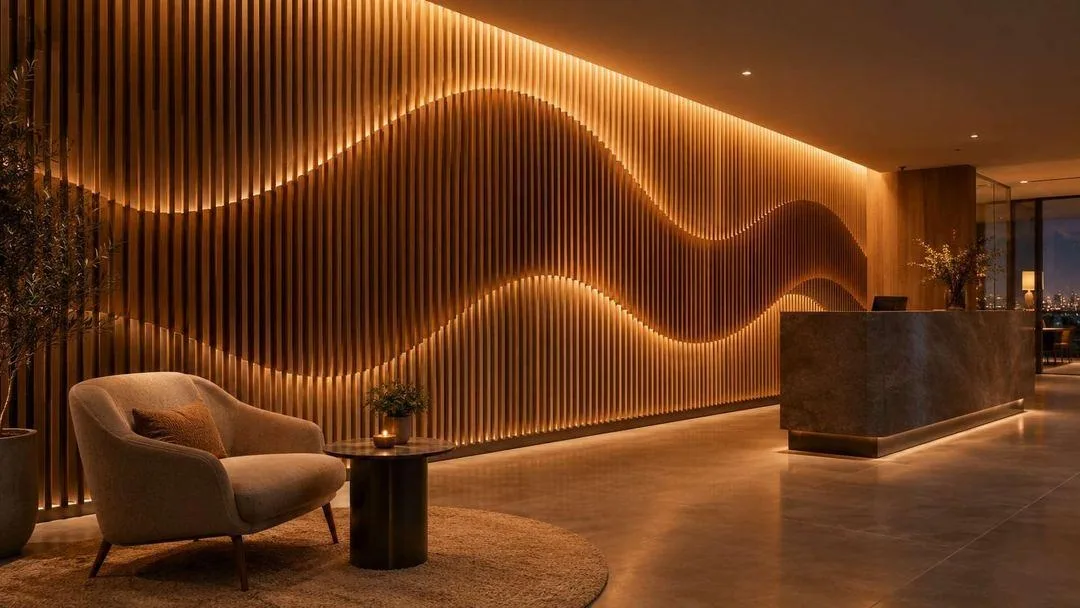
Hundreds of slim vertical fins in graduated oak forming a rippling wave, backlit with concealed warm LED. Textured three-dimensional wall systems are one of the strongest commercial demand categories right now, and they double as acoustic treatment in a hard-surfaced lobby.
3. An oversized photographic triptych
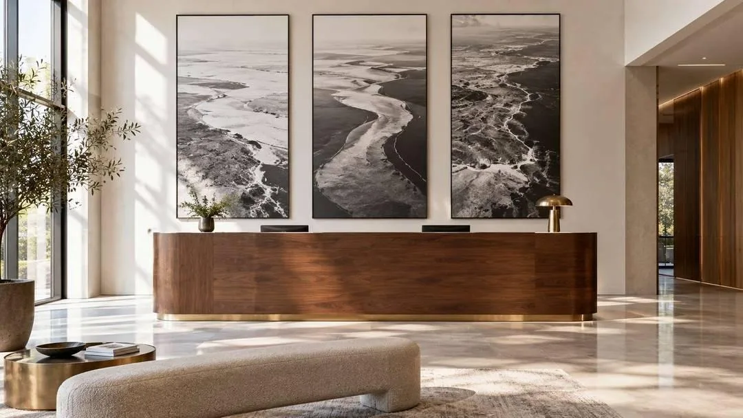
Three tall panels of abstract aerial landscape in slim black frames, generously spaced behind the desk. Large-scale photography is specifically named in 2026 commercial art demand, and it reads as considered rather than corporate.
4. A carved plaster relief wall
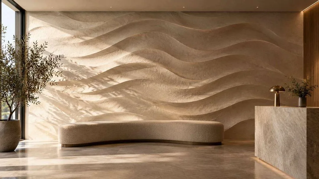
The whole wall finished as a continuous undulating plaster surface. There is no image at all — only shadow, and the shadow changes with the light through the day. Nothing to date, nothing to replace, nothing to read.
5. A local commission
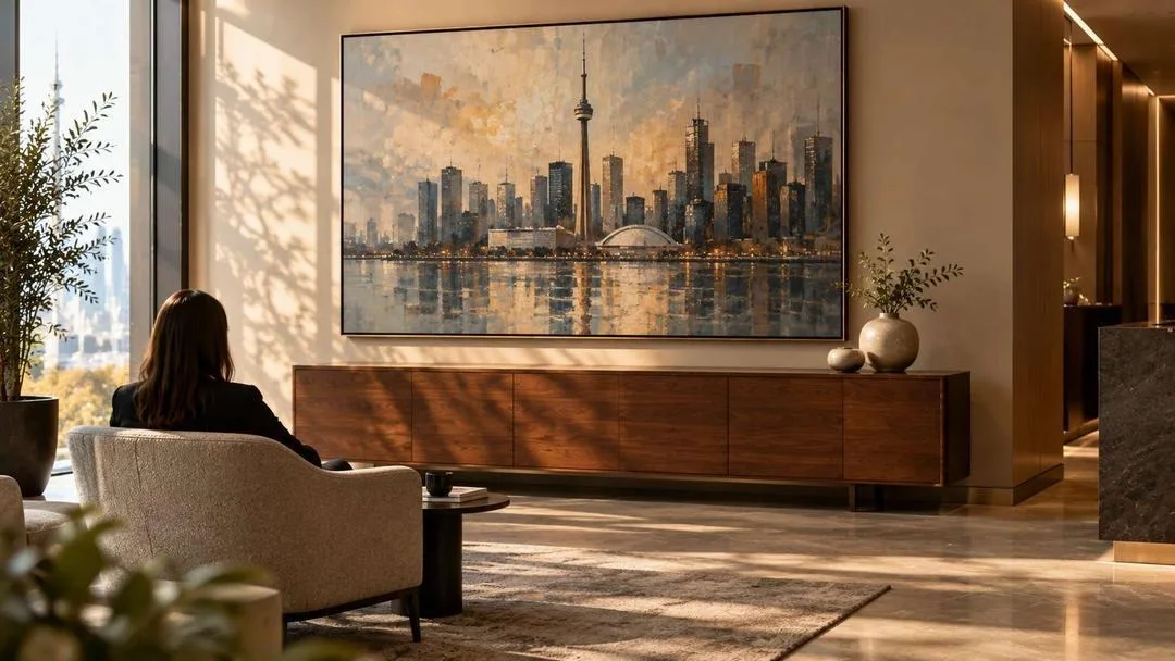
An abstracted view of the city the office actually sits in, painted by someone who lives there. Warm woods, local art and natural textures are what clients are gravitating toward, and a local piece says something about the company that a stock print cannot.
Waiting areas and lounges
People sit in these spaces with nothing to do but look at the walls, often while slightly anxious. This is where art does the most measurable work.
6. Fractal pattern art
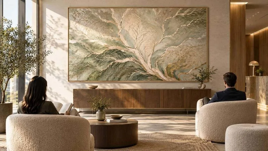
Branching, leaf-vein and river-delta forms layered in sage, bone and pale gold. This is biophilic design past the potted-plant stage — the repeating patterns of nature reproduced in the artwork itself, which is what reduces stress rather than the greenery alone.
7. A rotating gallery rail
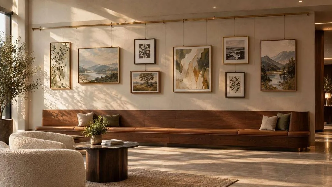
A brass rail with adjustable cables holding eight works of varying size. Swap the display quarterly, feature local artists, and the space never goes stale. The cheapest way to keep a wall alive for years.
8. Upholstered acoustic panels as art
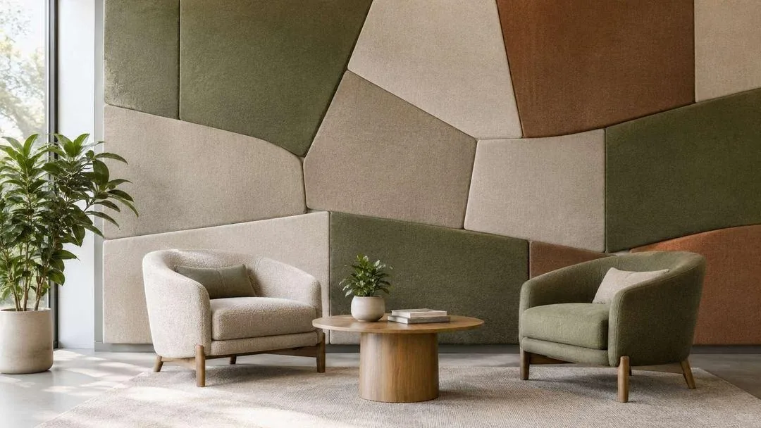
Large panels in moss, oatmeal and clay arranged in an irregular tessellation that reads as an abstract composition. It absorbs sound and decorates in one move, which is the most useful thing any office wall can do.
9. An architectural photography series
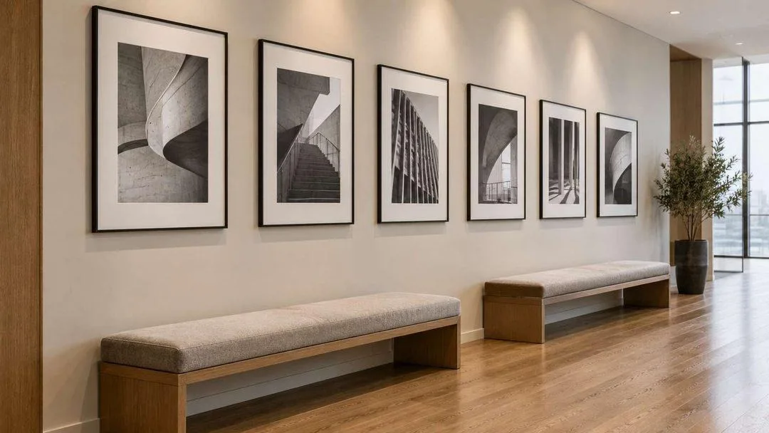
Six black-and-white studies of concrete curves and structural detail, evenly spaced in slim black frames. Architectural subjects are the safest choice in a client-facing space — interesting, entirely uncontroversial, and they suit any industry.
Cafeteria and break room wall decor
The loudest, busiest room in the building, and the one where people actually relax. The walls here can take more energy than anywhere else — and should.
10. One oversized abstract over the long tables
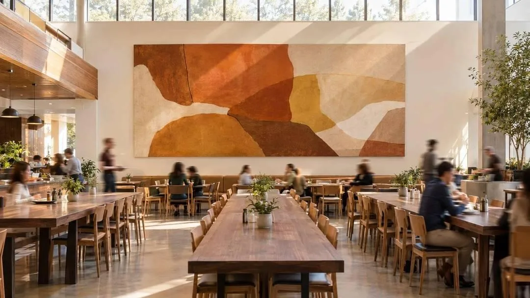
Warm terracotta, ochre and cream at genuine scale, food-adjacent in palette only. A single large piece holds a busy room together in a way that a scattering of small frames never will.
11. A hand-drawn chalk illustration wall
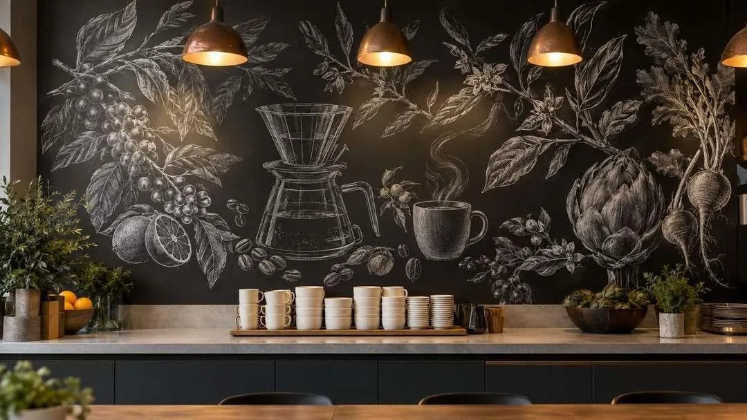
Deep matte charcoal covered edge to edge with illustrations of produce, coffee equipment and botanical forms — entirely pictorial, no lettering. The modern version of the chalkboard, with none of the rustic signage that dates it.
12. Botanical acoustic panels
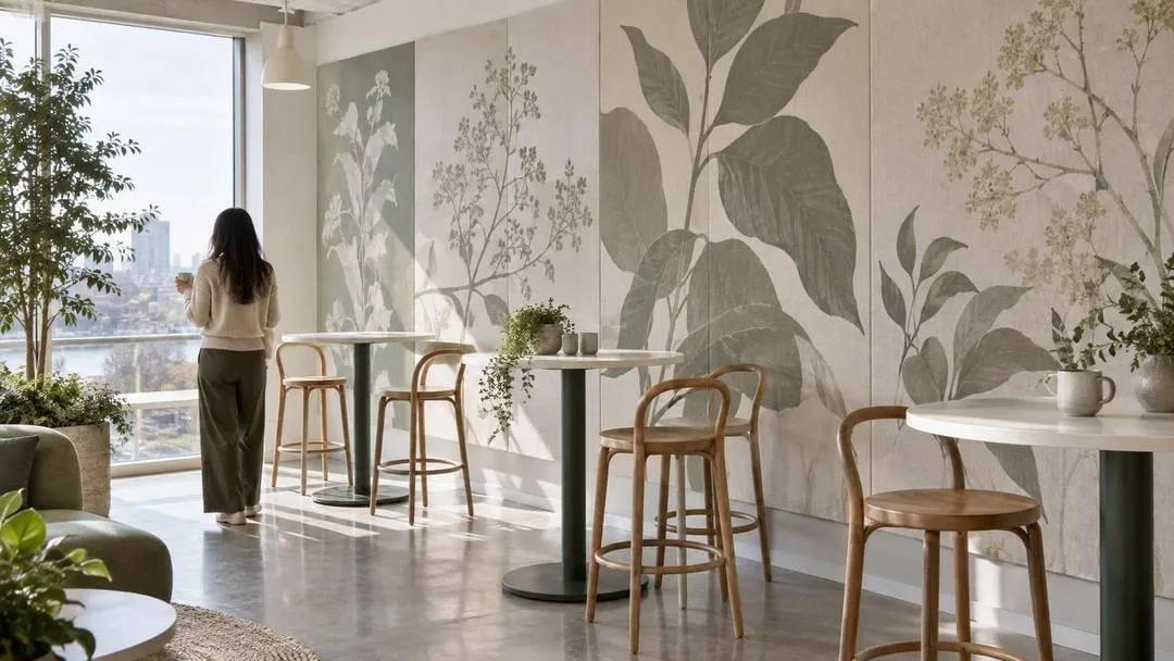
Oversized abstracted leaf forms printed onto sound-absorbing panels in muted sage. Break rooms are acoustically brutal — hard floors, hard tables, crowds — and printed acoustic panels fix that while looking like a design decision.
13. A salon-style local photography wall
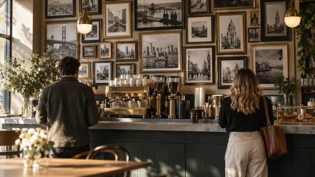
Vintage black-and-white photographs of the city, mismatched frames, hung tightly above the coffee bar. It gives people something to look at while they wait, which is the whole job of a wall in a queue.
14. A community photo wall
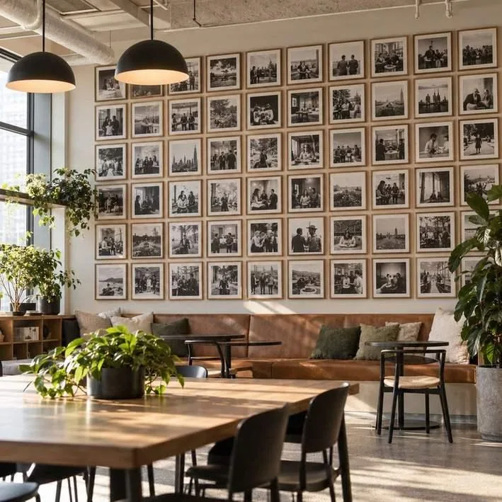
A grid of small frames holding candid workplace photographs in warm monochrome, built up over years. This is culture made physical, and it is the one idea here that costs nothing and cannot be bought.
Open plan and workstation walls
The hardest zone to get right. Anything interesting enough to notice is interesting enough to distract, so the brief here is quiet, large and useful.
15. Printed acoustic panels above the desks
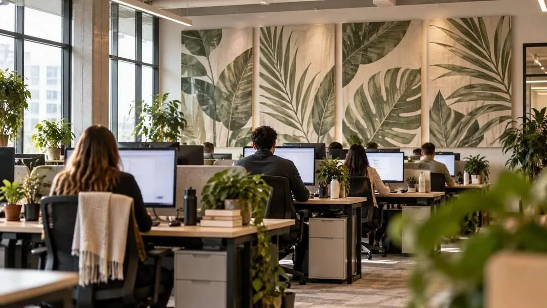
The single most practical idea in this article. Abstracted frond and leaf forms on fabric panels mounted above workstations — they cut reverberation across an open floor and give the eye somewhere soft to land between tasks.
16. A modular interchangeable panel system
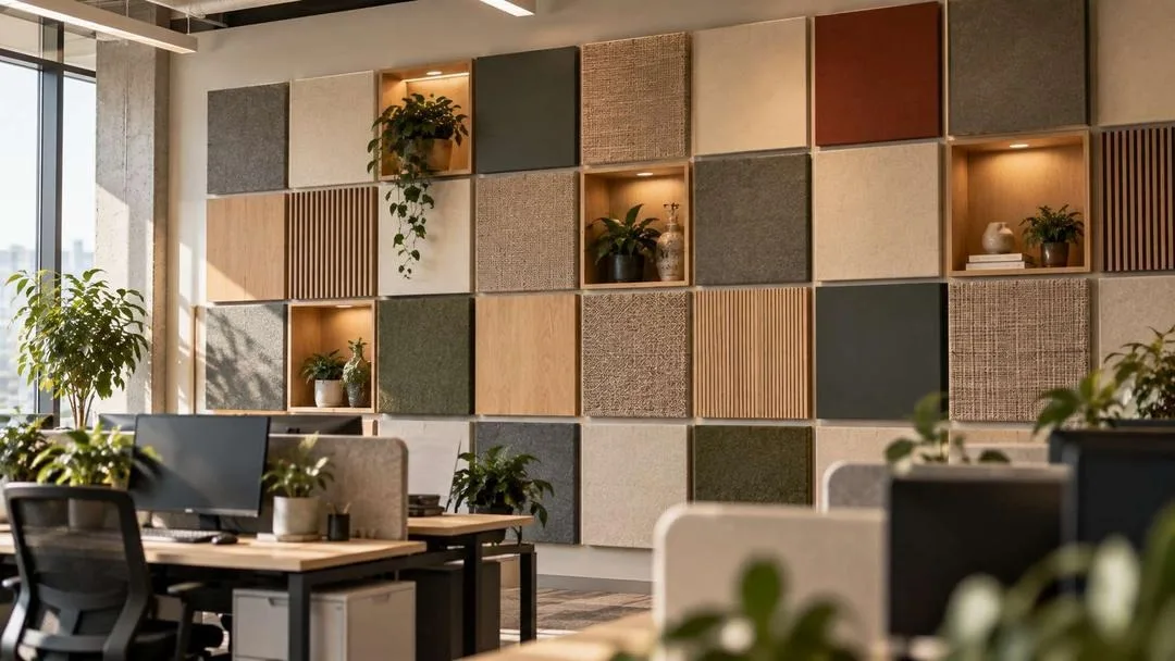
A grid of square panels in felt, veneer, painted metal and woven textile, some recessed and some proud. Modular installations are a growing commercial category precisely because they adapt when the floorplan changes, which it will.
17. One very large low-contrast abstract
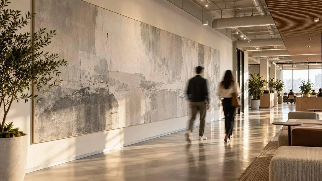
Soft fog grey and bone spanning a long circulation wall, deliberately quiet. The test for open-plan art is whether you could work with your back to it all day. Most art fails that. This kind passes.
18. Colour-zoned wayfinding art
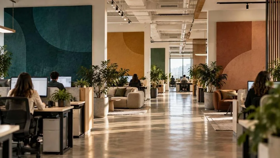
Each department marked by a large abstract colour-field panel — deep teal, warm ochre, soft clay — doing the job of signage without any signage. People navigate by colour far faster than by reading, and it looks infinitely better.
Meeting rooms and boardrooms
Every wall in these rooms appears on a video call. Treat them as sets, not as galleries — and note that the wall behind the head of the table is the one the whole company will see.
19. One calm landscape behind the head of the table
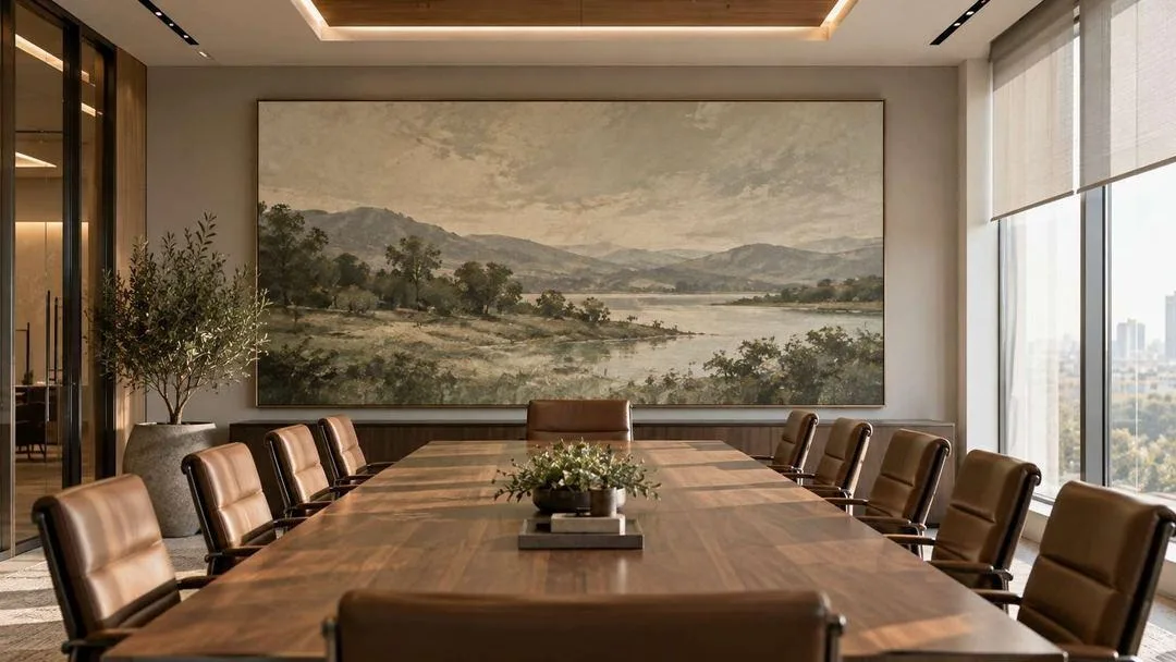
Muted sage, slate and bone at full width. It reads well on camera because it is low-contrast, and it gives a difficult meeting somewhere neutral to look. The most useful piece of art in any building.
20. An abstract timeline mural
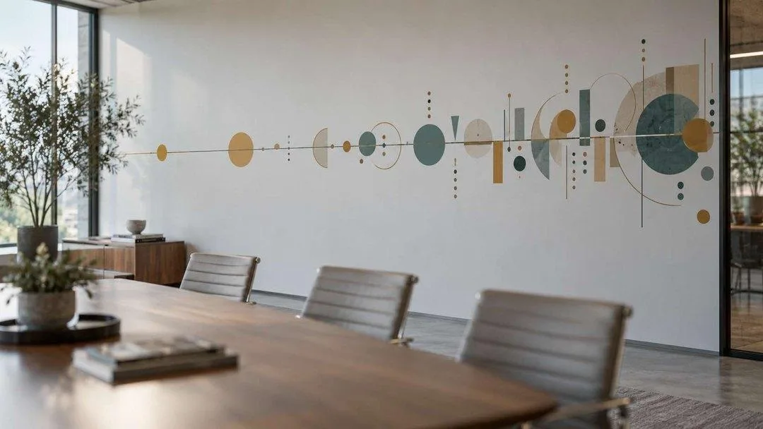
A continuous line punctuated by arcs and blocks growing denser toward the right — milestones rendered as marks rather than dates. Timeline murals have replaced the logo wall, and keeping them wordless means they never need updating.
21. Calligraphic art as abstract form
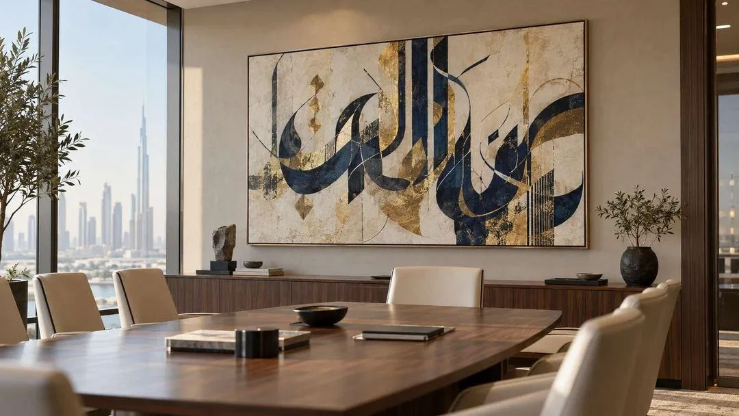
Flowing Arabic calligraphic forms in the modern hurufiyya tradition, treated as pure composition in indigo and burnished gold. It is a genuinely beautiful and under-used option in American offices, and it suits global-facing companies in a way generic abstraction does not. Commission it from a practising calligrapher and ask what the forms mean before you hang it.
22. A geometric relief feature wall
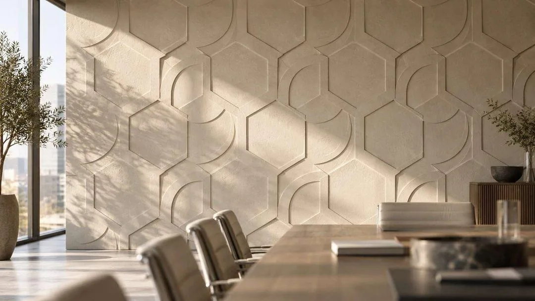
Interlocking hexagons and arcs in low-relief bone plaster, functioning as a brand motif without being a logo. Branding in 2026 is pattern, material and rhythm — not a mark on the wall.
Focus rooms and restorative zones
Quiet pods, wellness rooms and phone booths are now standard spec rather than a perk. The art in them has one job: lower the temperature.
23. A softly blurred abstract in the wellness room
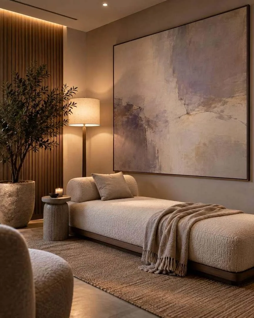
Pale lavender, bone and warm grey with no hard edges anywhere, above a low daybed. Restorative zones work when there is nothing in them demanding attention — including the art.
24. Curved timber tile cladding by the phone booths
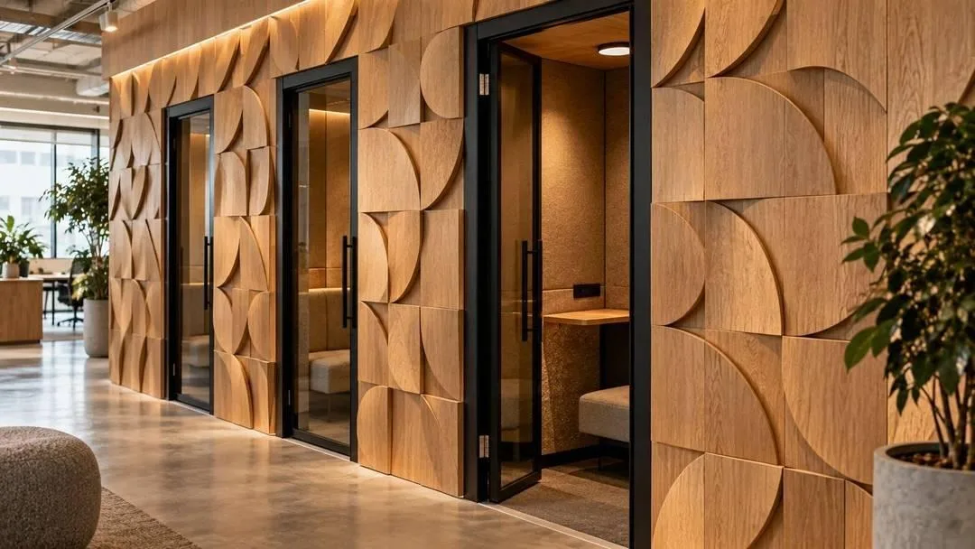
Overlapping curved oak tiles across the surrounding wall, absorbing sound and reading as sculpture. Phone booth banks are acoustically and visually the ugliest thing on most floors; this fixes both at once.
25. One minimal graphic in the library corner
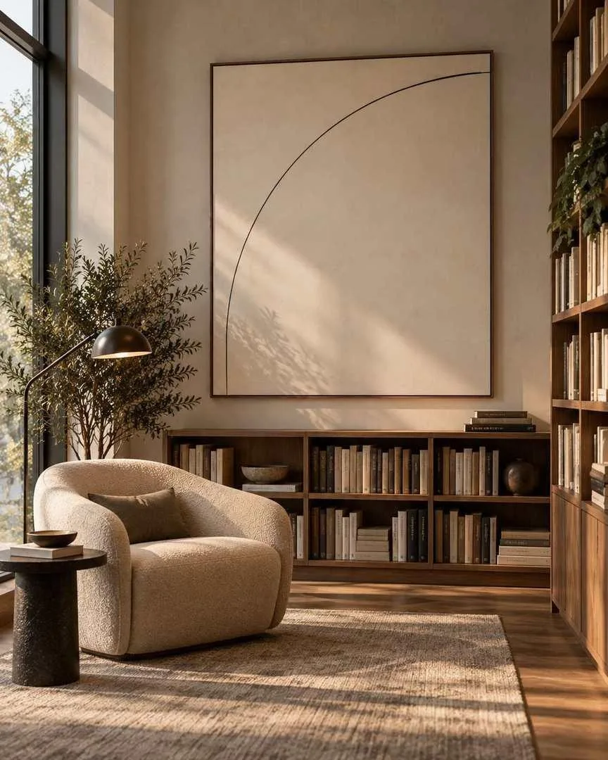
A single thin arc on a large cream field above low shelving. In a room meant for reading and thinking, the most sophisticated choice is almost nothing at all.
Corridors, stairwells and circulation
Dead space in most buildings, and the easiest win available. Nobody stands still here, so these walls can take scale and drama that a workstation wall cannot.
26. A full-height stairwell installation
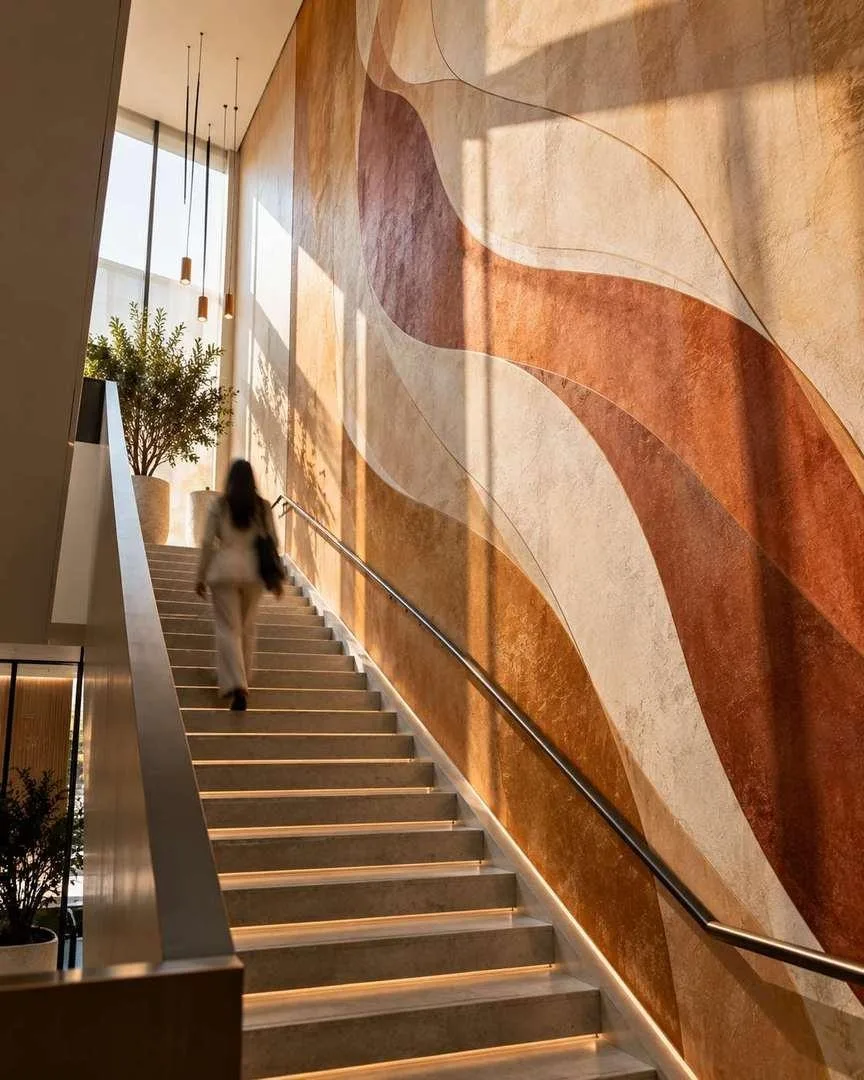
Flowing ribbons of ochre, rust and bone running the whole height of the stair, changing as you climb. Stairwells are the most under-used vertical surface in any office and the one place where genuine ambition costs relatively little.
27. A rhythmic corridor series
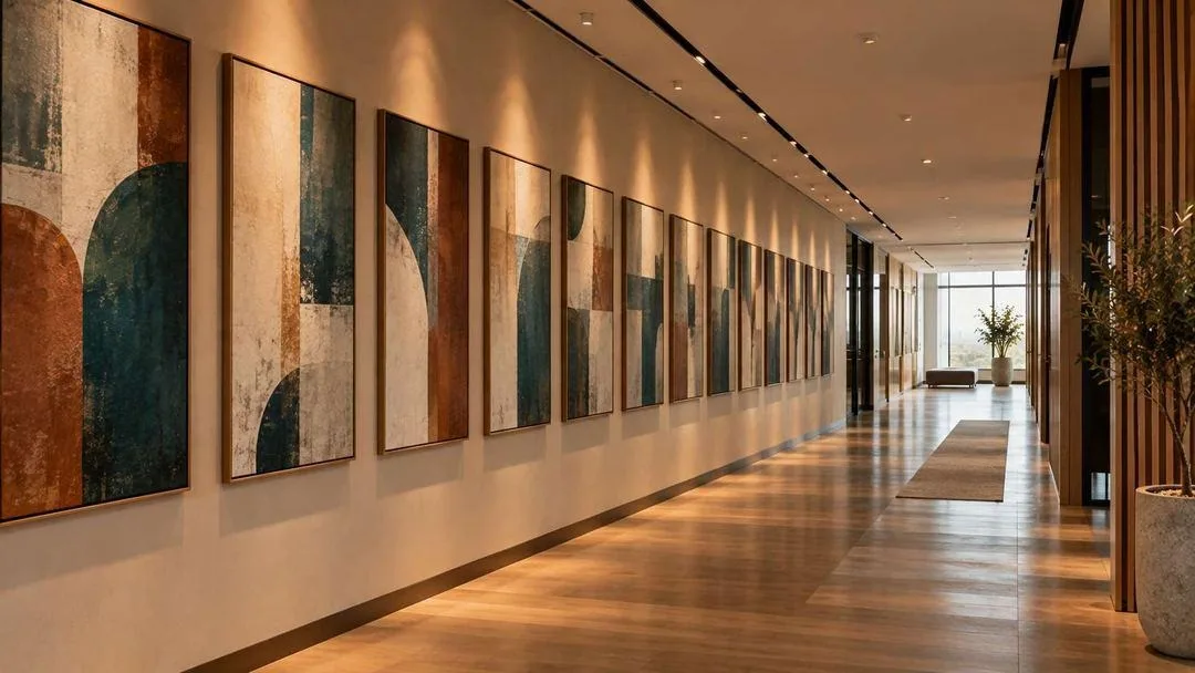
Twelve works in one palette, identically framed and evenly spaced down a long wall. The repetition is the effect — it turns a walk into a sequence and makes a bland corridor feel designed.
28. A dimensional disc installation in the lift lobby
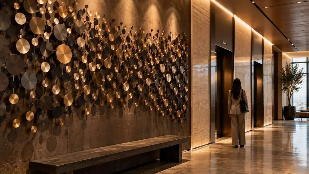
Hundreds of small brass and blackened-steel discs mounted at varying depths, catching light differently as you move. People stand in lift lobbies with nothing to do. Give them something that rewards thirty seconds of looking.
Home office wall decor
Everything above assumes a building. Most people reading this have a corner of a spare room — and a webcam pointed at it. These three home office wall decor ideas are built around what the camera sees.
29. Hang for the camera, not the room
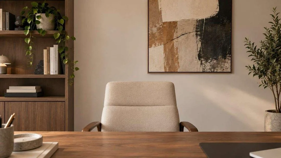
Sit where you work, open your camera app, and look at what is actually behind you. One medium piece slightly off-centre behind your shoulder, hung four to six inches higher than standard, is the entire formula. Dead-centre behind your head reads as a halo and looks staged.
30. Pair one frame with one short shelf
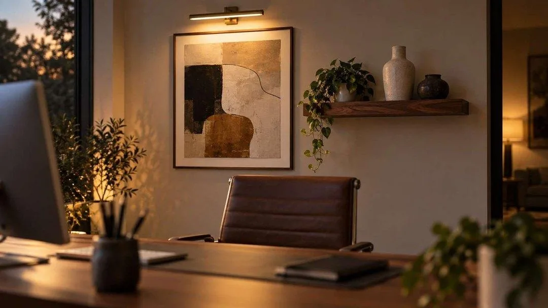
A framed abstract, a short walnut shelf with two objects, and a picture light above the frame. The shelf adds depth on camera, which a flat wall never does, and the picture light means you look intentional on an evening call.
31. In a small nook, go vertical and go once
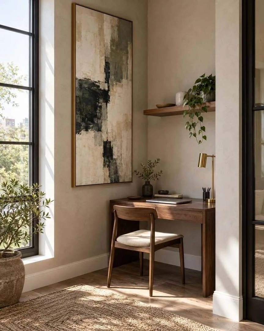
One tall canvas above a compact desk rather than three small frames. Small home offices fail by accumulating — a single larger piece makes the corner read as a room rather than a leftover.
How to hang office artwork: sizing and placement
Four rules cover almost every mistake made when choosing artwork for office walls.
- Two-thirds the furniture below it. Art above a credenza, desk or bench should span roughly two-thirds its width. In a lobby, size to the wall instead — large enough to be seen from the door.
- 57 to 60 inches to centre in shared spaces, higher at home. Standard gallery height works where people are standing or walking. Behind a home-office desk, raise it so it sits in the camera frame rather than below it.
- Match scale to viewing distance. A corridor piece is seen at four feet and can carry detail. A lobby piece is seen at forty and cannot. Specify by zone, not by taste.
- Check it on a screen before you commit. Photograph the wall, drop the artwork in, shrink it to thumbnail size. If it turns to mush, it will turn to mush on a call too.
| Zone | What works | What fails |
|---|---|---|
| Reception / arrival | One large commissioned or dimensional piece | Several small framed prints |
| Waiting area | Fractal, biophilic, calm abstraction | High contrast, anything unsettling |
| Cafeteria | Bold colour, murals, photo walls | Anything precious or fragile |
| Open plan | Printed acoustic panels, quiet abstracts | Detail, text, saturated colour |
| Meeting rooms | Low-contrast landscape or abstract | Busy pattern, readable words |
| Quiet / wellness rooms | Soft, blurred, almost nothing | Anything demanding attention |
| Corridors and stairs | Scale, repetition, drama | Small isolated pieces |
| Home office | One piece, off-centre, hung high | Cluttered shelves in frame |
What are the current office decor trends?
Five shifts are visible across everything above, and they all point in the same direction — offices are being designed to be worth the commute.
- Art as a wellness amenity. It has moved from the “if budget allows” column into standard specification, on the strength of measurable wellbeing and productivity gains.
- Biophilic design past the plant stage. Not more greenery — the textures, fractal rhythms and organic forms of nature reproduced inside the artwork itself. See biophilic design for the underlying principle.
- Texture over image. Three-dimensional wall systems, carved plaster, timber fins and acoustic relief are outpacing flat printed art in commercial specification.
- The hotel arrival experience. Reception desks becoming concierge-style arrival zones, with the art doing the work a logo used to do.
- Branding as pattern, not mark. Timeline murals, values expressed as motif, local commissions. The logo on the lobby wall now reads as dated.
Office wall decor: FAQ
What should I put on the walls of my office?
Calm, large, low-contrast work: abstract or nature-derived art, large-scale photography, or a textured wall system. Avoid readable text and busy pattern — both distract in person and resolve badly on video calls. In a home office, one medium piece hung slightly higher than standard, positioned off-centre behind your shoulder, is all you need.
What is the best wall decor for an office?
For shared spaces, one piece at genuine scale rather than several small ones — scale is what makes a lobby or corridor memorable. For workstations, printed acoustic panels are the most useful option because they cut noise and decorate at once. For meeting rooms, a low-contrast landscape behind the head of the table.
What are some good wall decorations for an office?
A commissioned mural in the arrival zone, a rotating gallery rail in the lounge, printed acoustic panels over open-plan desks, a community photo wall in the break room, colour-zoned panels used as wayfinding, and a full-height installation in the stairwell. Each suits a different zone — what works in reception fails above a bank of desks.
What are the current office decor trends?
Art specified as a wellness amenity rather than decoration; biophilic design that reproduces natural texture and fractal pattern rather than just adding plants; three-dimensional textured wall systems; reception areas rebuilt as concierge-style arrival zones; and branding expressed as pattern and material rather than a logo on the wall.
What is the best office artwork for a professional or corporate space?
Architectural photography, abstract landscape, and nature-derived abstraction are the safest choices — interesting, uncontroversial, and suited to any industry. Avoid anything with a message, anything political, and anything with readable words. In client-facing areas, a local commission says more about a company than a stock print ever will.
What should I hang behind me for video calls?
One medium piece slightly off-centre behind your shoulder, hung four to six inches higher than standard gallery height because a webcam crops the bottom of the frame. Choose something low-contrast without fine detail or text — busy artwork turns to noise at video-call resolution and words distract the person you are talking to.
What kind of art reduces stress at work?
Nature-derived work: organic forms, fractal and repeating natural patterns, muted palettes, landscape and botanical subjects. A study of 7,600 office workers across sixteen countries found those in workspaces with natural elements reported 15% higher wellbeing, 6% higher productivity and 15% higher creativity.
What is unique office wall art that isn’t generic?
A commissioned mural, a local artist’s work, a community photo wall built from your own team’s photographs, or abstract calligraphic art. Anything commissioned or accumulated is by definition unique — the generic feeling comes from buying finished inventory, not from any particular style.
How much should a company spend on office artwork?
Treat it as a line item in the fit-out budget rather than an afterthought, and specify by zone. A single commissioned lobby piece will cost more than forty framed prints, and it will do more. Rotating rails and modular systems spread the cost over years and adapt when the floorplan changes.
What office wall art should I avoid?
Motivational typography, anything with readable words, stock inspirational photography, high-contrast geometric pattern near workstations, and the company logo as decoration. All five are common, all five date quickly, and the first two actively distract on video calls.
Start with the zone, not the artwork
The mistake is choosing a piece you like and then finding a wall for it. Work the other way: decide which zone you are treating, what it is for, and how far away people stand — then choose. A lobby wall and a workstation wall want opposite things, and the piece that fails in one will often be perfect in the other.
For the rest of the house, bedroom wall decor ideas, kitchen wall decor ideas and wall art for living room apply the same room-by-room logic. If you would rather build the shelving and ledges yourself, DIY projects at home covers both.