How to Arrange Pictures on a Wall: Layouts, Spacing and Frame Rules
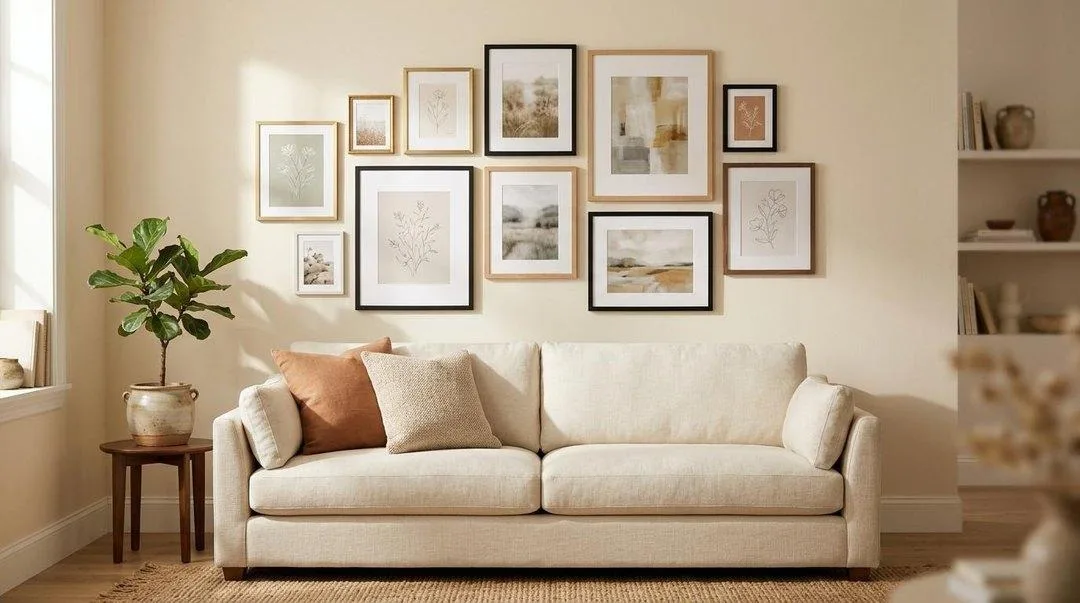
Almost every gallery wall that looks wrong went wrong in the same three places, and none of them have anything to do with taste. The frames were hung too high, the gaps between them were uneven, and the group was too small for the wall it sat on.
Fix those three and almost any collection of frames looks deliberate. This guide covers how to arrange pictures on a wall properly — the three measurements that matter, six gallery wall layout templates that always work, exact arrangements for three, four, five and six frames, and the floor-and-paper method that lets you get it right before you drill a single hole.
To arrange pictures on a wall, keep 2 to 3 inches between every frame, make the whole group span about two-thirds the width of the furniture below it, and hang it so the centre of the arrangement sits 57 to 60 inches from the floor. Lay the arrangement out on the floor first, trace each frame onto paper, and tape the paper to the wall before you hang anything.
The three numbers that decide everything
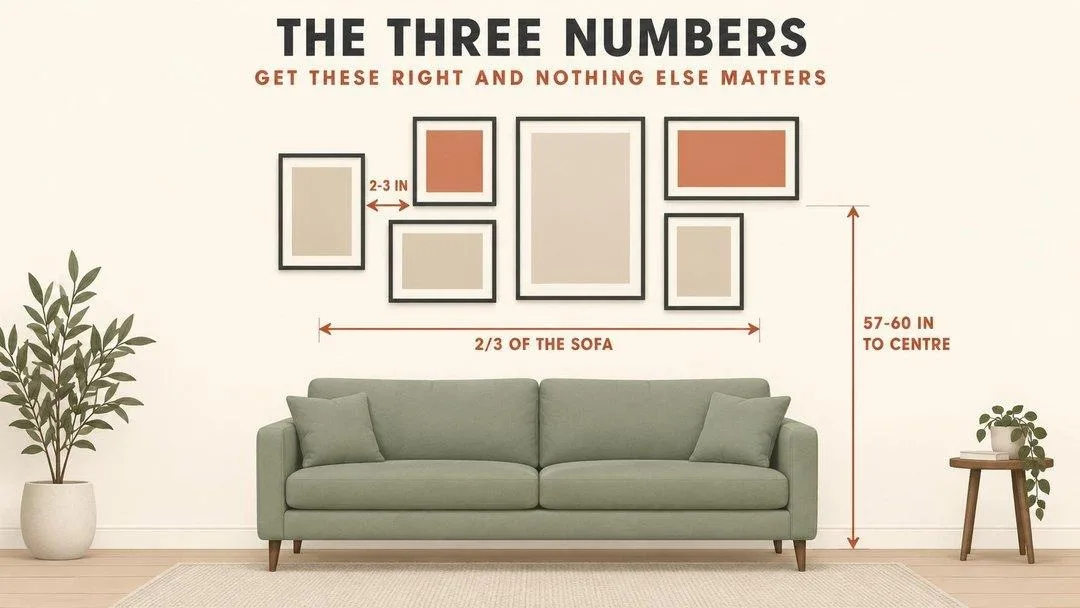
Before layouts, before frame choices, before anything: these three measurements are what separate a gallery wall that looks designed from one that looks like frames landed on a wall. Every professional arrangement obeys all three.
1. Two to three inches between frames
The same gap, everywhere, with no exceptions. Consistency matters far more than the exact figure — two inches throughout looks deliberate, and so does three, but two in one place and four in another reads instantly as a mistake. Larger frames can take three inches; small frames look stranded at anything more.
2. Two-thirds the width of the furniture below
This is the 2/3 rule, and it is the one people break most often by going too small. A standard 84-inch sofa wants about 56 inches of arrangement measured edge to edge, including the gaps. Over a 60-inch console, aim for 40 inches. When you are between two options, always take the larger one — art that is slightly too big reads as confident, art that is too small reads as an accident.
3. Fifty-seven to sixty inches to the centre
Measure to the centre of the whole arrangement, not to the top frame and not to each individual piece. This is gallery standard and it is roughly average eye level. Above a sofa, also leave 6 to 10 inches between the sofa back and the bottom of the lowest frame so the group relates to the furniture rather than floating above it.
The one that catches everyone: people hang pictures too high. If you have ever looked at a wall and thought something was off but could not say what, it was almost certainly this. Twenty to twenty-four inches above a sofa back is too much — six to ten is right.
Lay it out on the floor first
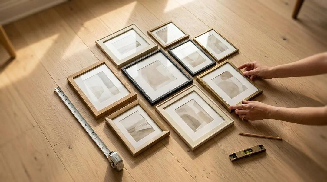
Do not start on the wall. Every arrangement in this guide should be built on the floor, adjusted until it looks right, and only then transferred upward. It costs twenty minutes and it saves a wall full of unnecessary holes.
- Measure your wall space first. Mark out the available width and height on the floor with tape so you are working inside the real footprint rather than guessing.
- Start with your largest frame slightly off-centre. Build outward from it. Starting with the big piece dead centre is what produces stiff, symmetrical arrangements that look like a hotel corridor.
- Balance visual weight, not frame count. A large dark frame on one side needs two or three smaller ones on the other. Squint at the arrangement — blurring the detail shows you the balance immediately.
- Keep every gap identical. Cut a scrap of card to two and a half inches and use it as a spacer as you lay out. This single trick does more than anything else on this page.
- Photograph it before you move anything. You will need the reference, and a photo on your phone makes uneven spacing obvious in a way your eye misses at floor level.
Then trace it onto paper
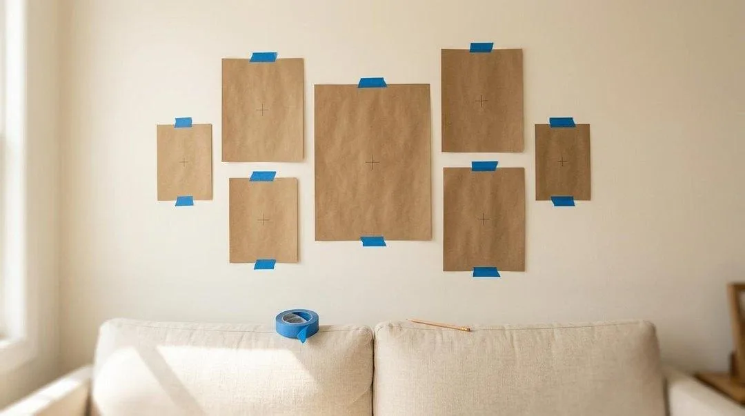
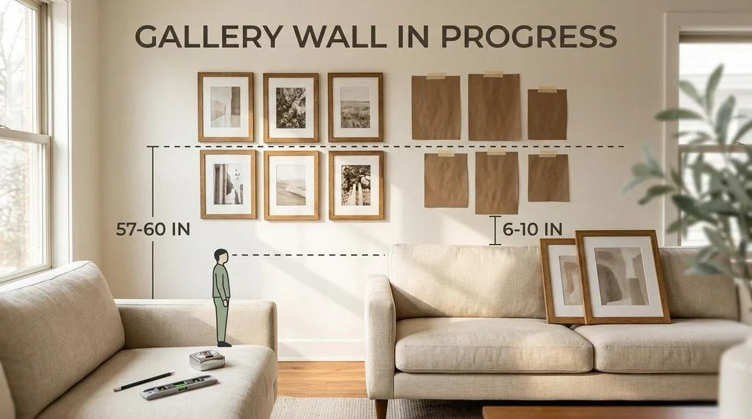
Draw round each frame on kraft paper or newspaper, cut the rectangles out, and mark the exact hanging point on each one — hang the frame on your finger, let it settle, and mark where the wire or hook sits. That mark is what you drill to, and it is why templates beat measuring frame heights.
Tape the paper templates to the wall with painter’s tape and live with them for a day. Look at them in morning light and evening light. Move them. This is the cheapest and most valuable step in the whole process, and almost nobody does it.
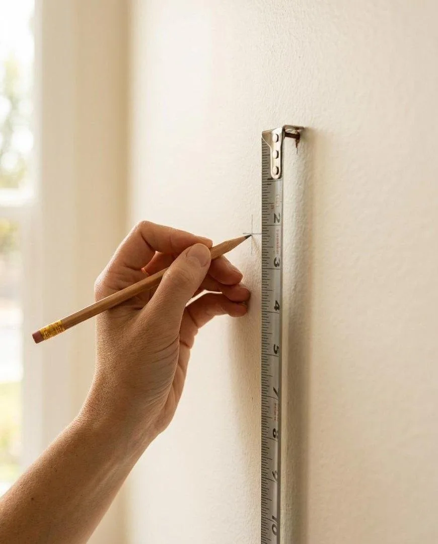
When you are happy, drill straight through the paper at the marked point, tear the template away, and hang. The frame lands exactly where the paper was.
Six gallery wall layouts that always work
Every successful arrangement is a version of one of these six. Pick the one that suits your wall and your frames rather than inventing something from scratch — these work because the geometry does the balancing for you.
The grid
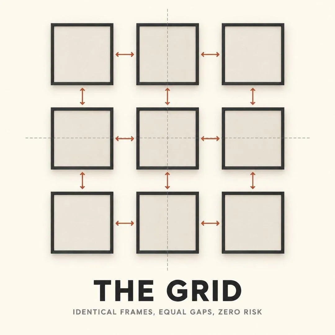
Identical frames, identical mats, equal gaps, in even rows and columns. The lowest-risk layout there is and the most forgiving of mediocre artwork, because the repetition becomes the design. Best with six, nine or twelve pieces. The only way to get a grid wrong is uneven spacing, so use a spacer for every gap.
The salon

Mixed sizes, mixed frames, densely packed, filling a defined shape. It looks improvised and it absolutely is not — the discipline is that the outer edge of the whole group forms a clean rectangle or square even though nothing inside is aligned. Keep the gaps tight and consistent and the chaos inside stays deliberate.
The linear row
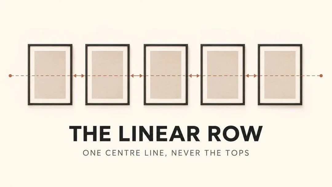
A single horizontal line of frames, ideal above a long sofa, sideboard or in a hallway. The critical rule: align the centres, not the tops. If your frames vary in height, a shared top line makes the bottoms ragged and the whole row looks accidental. One centre line fixes it.
The staircase
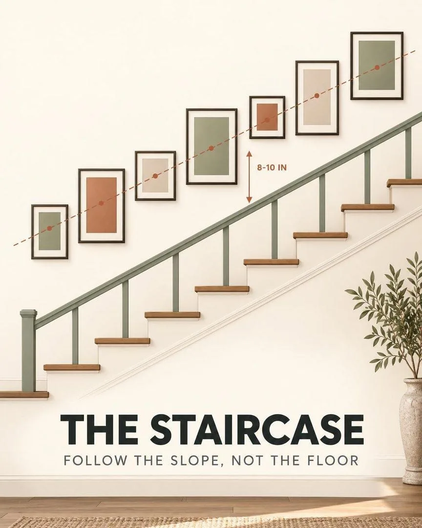
Frames climbing alongside the stairs, each one’s centre sitting the same perpendicular distance from the slope of the handrail. Follow the angle of the stairs, not the horizontal of the floor — stepping frames level is the most common staircase mistake and it fights the architecture every time.
The picture ledge

One or two narrow shelves holding leaning, overlapping frames. Nothing is committed, everything overlaps, and you can restyle the entire wall in ten minutes without touching a drill again. The most flexible option here and the best choice for renters or anyone who changes their mind.
The anchor
One large piece positioned off-centre with smaller frames orbiting it. Asymmetric but balanced — the visual centre of mass sits in the middle even though the big frame does not. The most sophisticated of the six and the hardest to get right, which is why the floor method matters most here.
How to arrange pictures by number of frames
If you already own a specific number of frames, this is the fastest route to a finished wall. Each of these arrangements is balanced by construction.
How to arrange 3 pictures on a wall
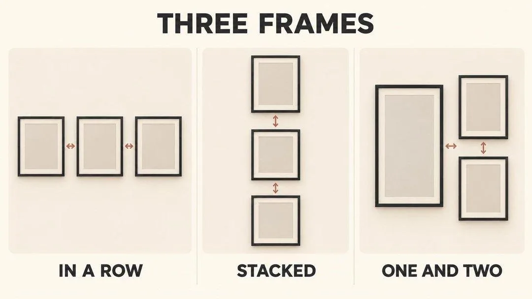
Three is the easiest number and has three clean answers. In a row for a wide wall above a sofa or bed, centres aligned. Stacked vertically for a narrow wall between doors or windows. One and two — a tall frame beside two stacked smaller ones — when your frames are not the same size. That third option is the most forgiving if you are working with what you already have.
How to arrange 4 pictures on a wall
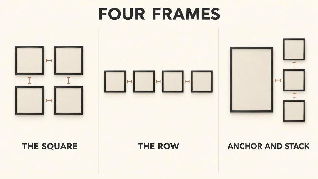
With four identical frames, a two-by-two square is almost impossible to get wrong and works over most furniture. A single row of four suits a long, low wall. If one frame is significantly larger, use it as an anchor on the left with three stacked to the right, which keeps the group balanced without symmetry.
How to arrange 5 pictures on a wall
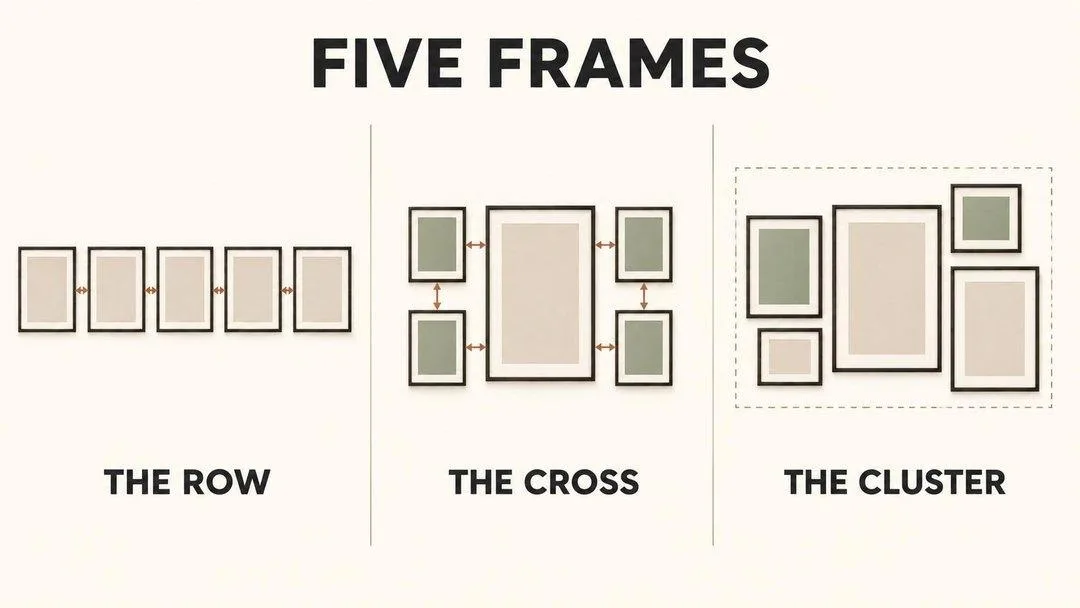
Five is awkward because it resists symmetry, which is exactly why it looks good. A row of five for a wide span. The cross — one larger central frame with two smaller stacked either side — for a square-ish wall. Or a staggered cluster inside an invisible rectangle for a more collected look. For five matching 8x10s, the row or the cross are the two that read as intentional.
How to arrange 6 pictures on a wall
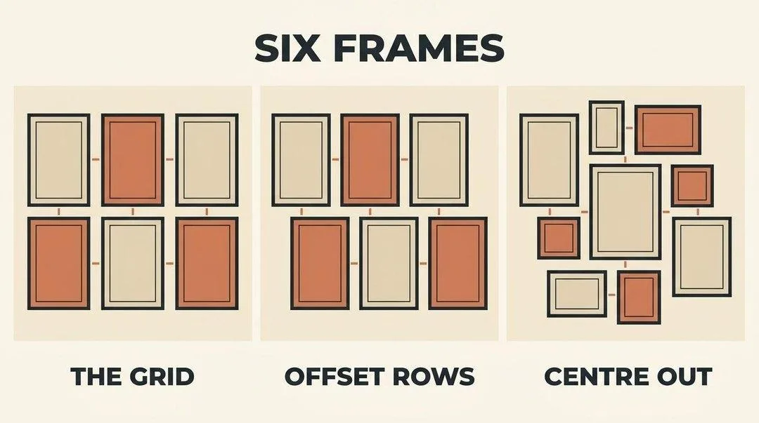
Six is the sweet spot for a first gallery wall. A three-by-two grid is the safe answer. Two offset rows of three loosens it without losing structure. Or work centre out from one larger frame with five smaller ones around it. All three fill a standard sofa wall comfortably.
Spacing: the detail that gives everything away
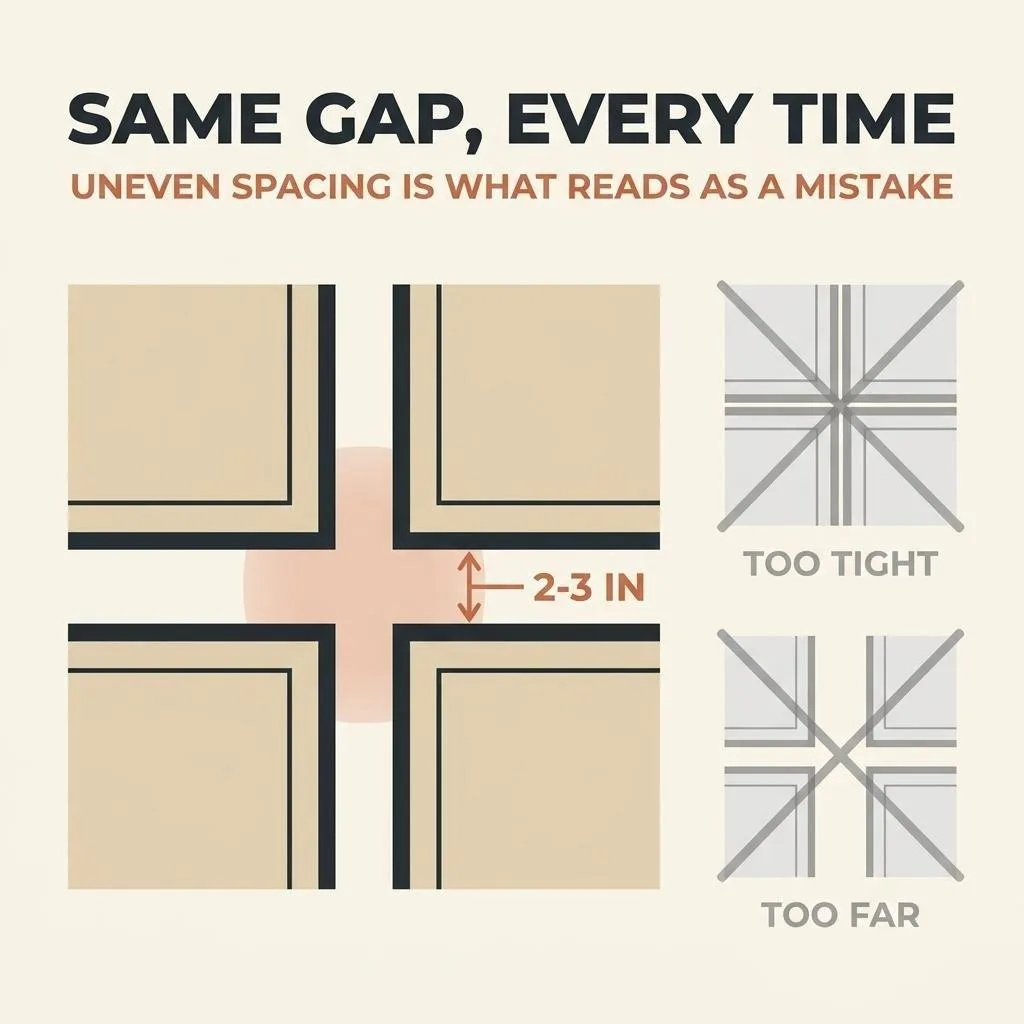
If you take one thing from this guide, take this. Uneven gaps are what makes an arrangement read as amateur, and they are entirely invisible to you while you work and glaringly obvious to everyone else afterwards.
- Cut a physical spacer. A strip of cardboard two and a half inches wide, used for every single gap. Do not eyeball it and do not measure each one with a tape — both drift.
- Tighter for small frames, wider for large. Two inches suits smaller work; three suits large frames. Pick one figure and hold it across the whole arrangement.
- Too tight looks cramped, too far looks scattered. Under an inch and the frames fight each other. Over four and the group stops reading as one object and becomes several separate things on a wall.
Hanging height: hang to the centre, not the top
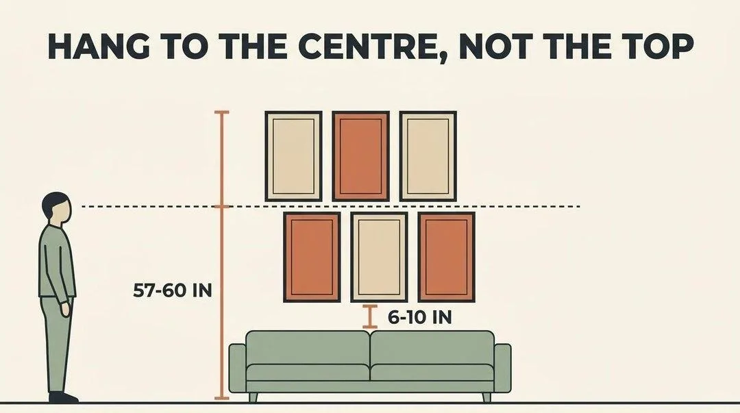
Measure to the centre of the entire arrangement and set that at 57 to 60 inches from the floor. Not the top frame, not the middle frame — the centre of the group treated as one object.
Two adjustments worth knowing. In a room where people are mostly seated — a living room or a dining room — drop toward 57. In a hallway or entryway where everyone is standing and walking, 60 is better. And above a bed or sofa, the 6 to 10 inch gap from the furniture matters more than the absolute height, because the eye reads the relationship rather than the measurement.
Mixing frames without it looking messy
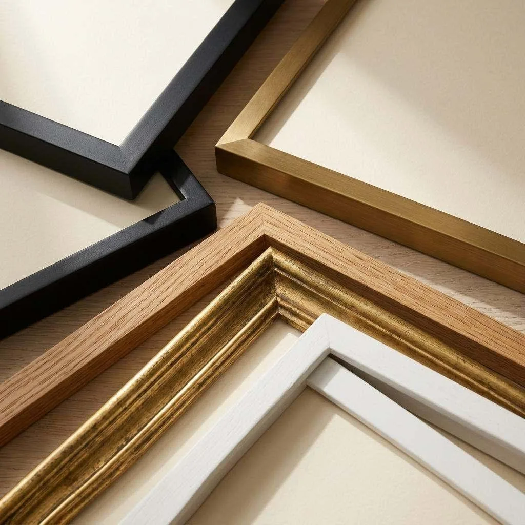
Matched frame sets have quietly gone out of fashion. The collected look — mixed finishes, mixed sizes, gathered over time — is what designers are doing now, but it only works with one unifying constraint.
- Vary the frames, unify something else. Mixed black, brass and oak frames work if all the artwork shares a palette. Matching frames work if the art is wildly varied. Change one, hold the other.
- Use white mats to calm a busy mix. A generous white mat around each piece creates visual breathing room and makes mismatched frames read as a collection rather than a jumble.
- Repeat each finish at least twice. One gold frame among eight black ones looks like a mistake. Three gold frames distributed across the group looks like a decision.
- Keep frame weights in the same family. Very chunky ornate frames and very slim modern ones do not sit well together regardless of colour. Match the visual weight before you match the finish.
Small walls and awkward spaces
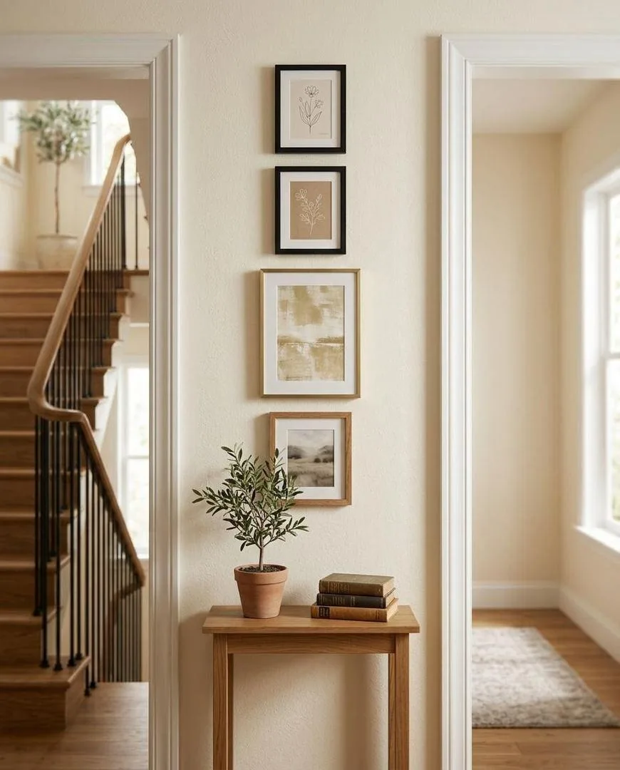
A narrow strip between two doorways, a chimney breast, the space above a radiator. These walls fail when people try to fit a cluster into them. They want a vertical column instead — three or four small frames stacked with even gaps, which draws the eye up and makes the strip look intentional rather than leftover.
For a small gallery wall generally: fewer frames, slightly larger, tighter gaps. Six small frames on a small wall looks cluttered; three medium ones looks designed. And on any wall under about three feet wide, a single well-sized piece almost always beats an arrangement.
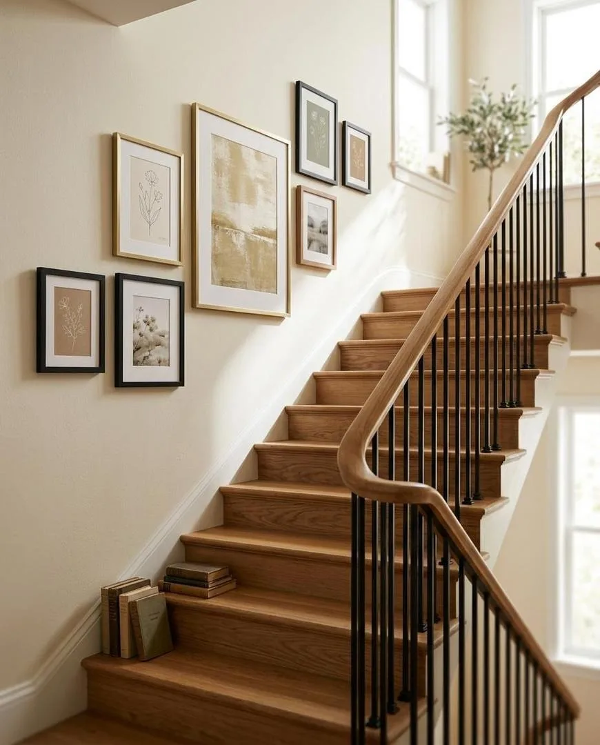
Staircases have their own rule. Hold a long level or a piece of string along the handrail angle, and set every frame centre the same perpendicular distance from it. The frames climb with the stairs. Levelling them horizontally is the mistake that makes a staircase gallery look wrong even when the spacing is perfect.
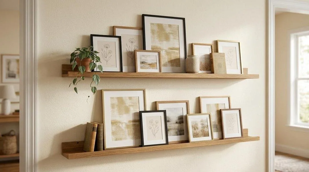
And if you rent, or you simply want to be able to change your mind, picture ledges solve everything at once. Two fixings per ledge, unlimited rearranging, no holes behind any individual frame.
The four most common gallery wall mistakes
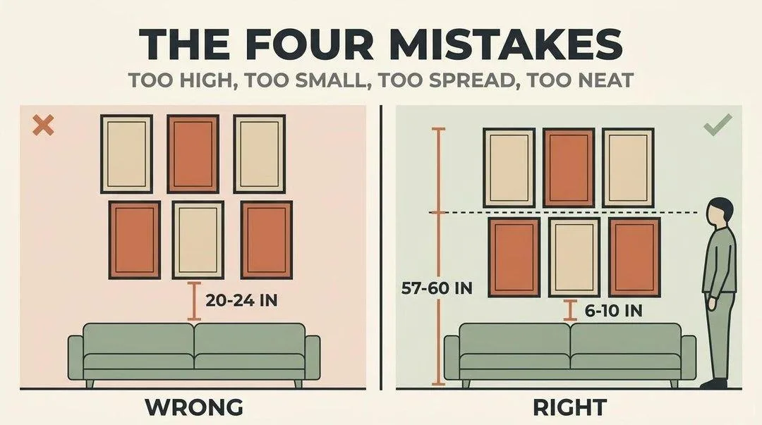
- Too high. By far the most common. Twenty inches or more above a sofa back leaves the arrangement stranded. Six to ten inches is correct.
- Too small. A cluster covering a third of the wall behind a large sofa reads as underwhelming no matter how good the art is. Two-thirds the furniture width, minimum.
- Too spread out. Gaps over four inches break the group into separate objects. The arrangement should read as one thing from across the room.
- Too neat. Perfect symmetry with matching frames and matching mats can look corporate rather than collected. If you want a grid, commit fully to the grid; if you want a salon wall, let the sizes genuinely vary.
Quick reference: sizing by furniture
| Furniture below | Arrangement width | Height to centre |
|---|---|---|
| Twin bed (39 in.) | 26-30 in. | 57-60 in. |
| Console / sideboard (60 in.) | 40-45 in. | 57-60 in. |
| Queen bed (60 in.) | 40-45 in. | 57-60 in. |
| Standard sofa (84 in.) | 54-58 in. | 57-60 in. |
| King bed (76 in.) | 50-56 in. | 57-60 in. |
| Large sectional (100 in.+) | 64-72 in. | 57-60 in. |
| Nothing below (open wall) | Size to the wall | 57-60 in. |
Arrangement width is measured edge to edge across the whole group, including the gaps between frames.
Free printable gallery wall planner
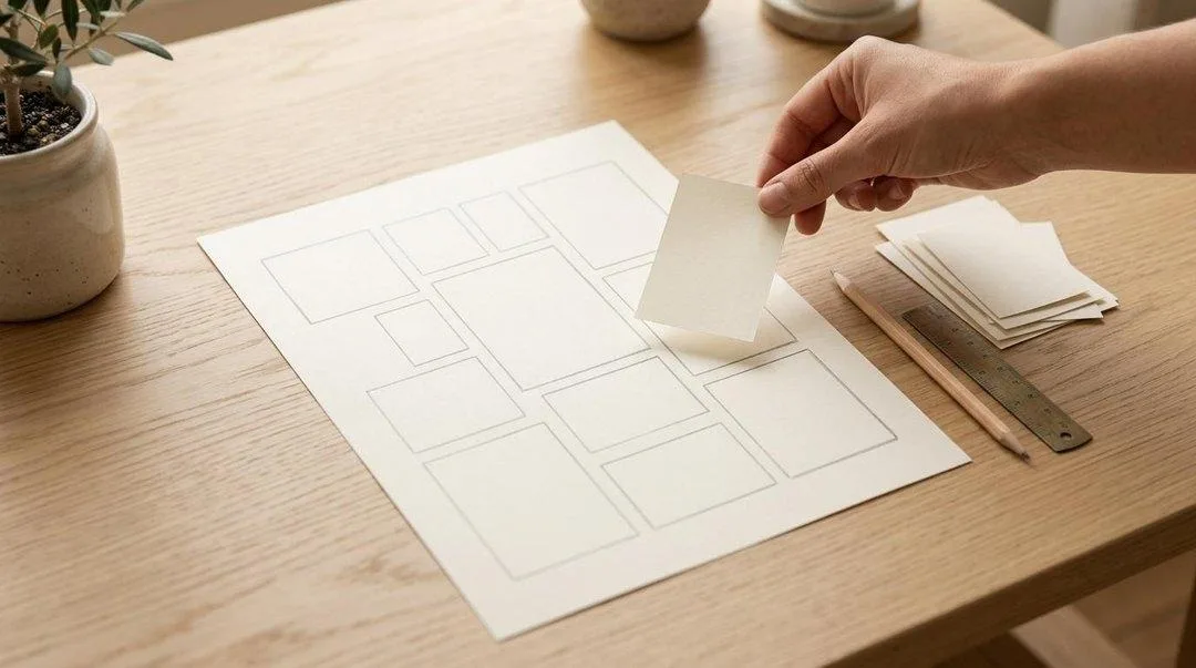
We built a gallery wall template pack to take the arithmetic out of this. It includes six scaled layout templates matching the arrangements above, a frame-spacing ruler you cut out and use as a physical spacer, cut-out rectangles at standard frame sizes for taping to the wall, and a planning grid for sketching your own arrangement before you commit.
It is free and ungated. Download the Gallery Wall Planner (PDF).
What to put in the frames: the Metropolitan Museum of Art’s open access collection offers hundreds of thousands of high-resolution artworks free to download and print. Botanical plates, Old Master studies and antique maps all frame beautifully and cost nothing but paper.
How to arrange pictures on a wall: FAQ
What is the best way to arrange photos on a wall?
Lay the whole arrangement out on the floor first, keep 2 to 3 inches between every frame, make the group span about two-thirds the width of the furniture below, and hang it with the centre of the group 57 to 60 inches from the floor. Trace each frame onto paper and tape the templates up before drilling.
What is the 2/3 rule for hanging pictures?
Artwork or a group of frames should span roughly two-thirds the width of the furniture it hangs above. An 84-inch sofa wants about 56 inches of arrangement, measured edge to edge including the gaps. It is the rule people break most often, almost always by going too small.
How to arrange 5 8×10 pictures on a wall?
Two arrangements work reliably. A single horizontal row of five with centres aligned and 2 to 3 inches between each suits a wide wall above a sofa. Or use a cross formation — one frame centred with two stacked either side — for a squarer wall. Five identical frames in a random cluster rarely reads as intentional.
Is there an app that will help me arrange pictures on a wall?
Several frame retailers offer layout tools, and most phone photo apps let you mock up an arrangement from a photo of your wall. But paper templates taped to the actual wall beat any app, because you see the real scale in the real light — which is what you are actually judging.
What is the rule for gallery walls?
Three numbers: 2 to 3 inches between frames, two-thirds the width of the furniture below, and 57 to 60 inches from the floor to the centre of the whole arrangement. Get those right and almost any combination of frames looks deliberate.
How high should pictures be hung above a sofa?
Leave 6 to 10 inches between the top of the sofa back and the bottom of the lowest frame, with the centre of the whole arrangement at 57 to 60 inches from the floor. Hanging 20 inches or more above the sofa is the single most common mistake and it leaves the art looking stranded.
How much space should be between pictures on a wall?
Two to three inches, and the same measurement everywhere. Cut a strip of cardboard to your chosen width and use it as a physical spacer for every gap. Consistency matters far more than the exact figure — uneven gaps are what makes an arrangement look amateur.
Are gallery walls out of style in 2026?
No, but the style has changed. Matched frame sets in perfect symmetry now look dated. What has replaced them is the collected look — mixed frame finishes, varied sizes, pieces gathered over time rather than bought as a set — held together by consistent spacing and one unifying element such as a shared palette or white mats.
What are common gallery wall mistakes?
Hanging too high, choosing an arrangement too small for the wall, spacing frames too far apart so the group stops reading as one object, and over-matching everything until it looks corporate. All four are fixed by the floor-and-paper method before you drill.
How do you arrange pictures on a staircase wall?
Follow the slope, not the floor. Hold a long level or string along the handrail angle and set every frame’s centre the same perpendicular distance from that line. Stepping frames horizontally is what makes a staircase gallery look wrong even when the spacing is perfect.
Can you mix different frame styles on a gallery wall?
Yes, and it is the current preference. The rule is to vary one thing and unify another: mixed frames with artwork in a shared palette, or matching frames with wildly varied art. Repeat each finish at least twice so it reads as a choice, and keep the visual weight of the frames in the same family.
How many pictures should be in a gallery wall?
Six to twelve for a standard sofa wall, three to five for a smaller space, and three in a vertical column for a narrow strip between doors. On a small wall, fewer and slightly larger always beats more and smaller.
Floor first, paper second, drill last
The whole method is those six words. Every mistake in this guide comes from starting at the wall with a hammer, and every good arrangement comes from having already solved it on the floor. Twenty minutes and a roll of painter’s tape is the difference.
For what actually goes in the frames, room by room: wall art for living room, bedroom wall decor ideas, kitchen wall decor ideas and office wall decor. If you want to build the picture ledges yourself, DIY projects at home has the method.